
Packaging & Brand Marks
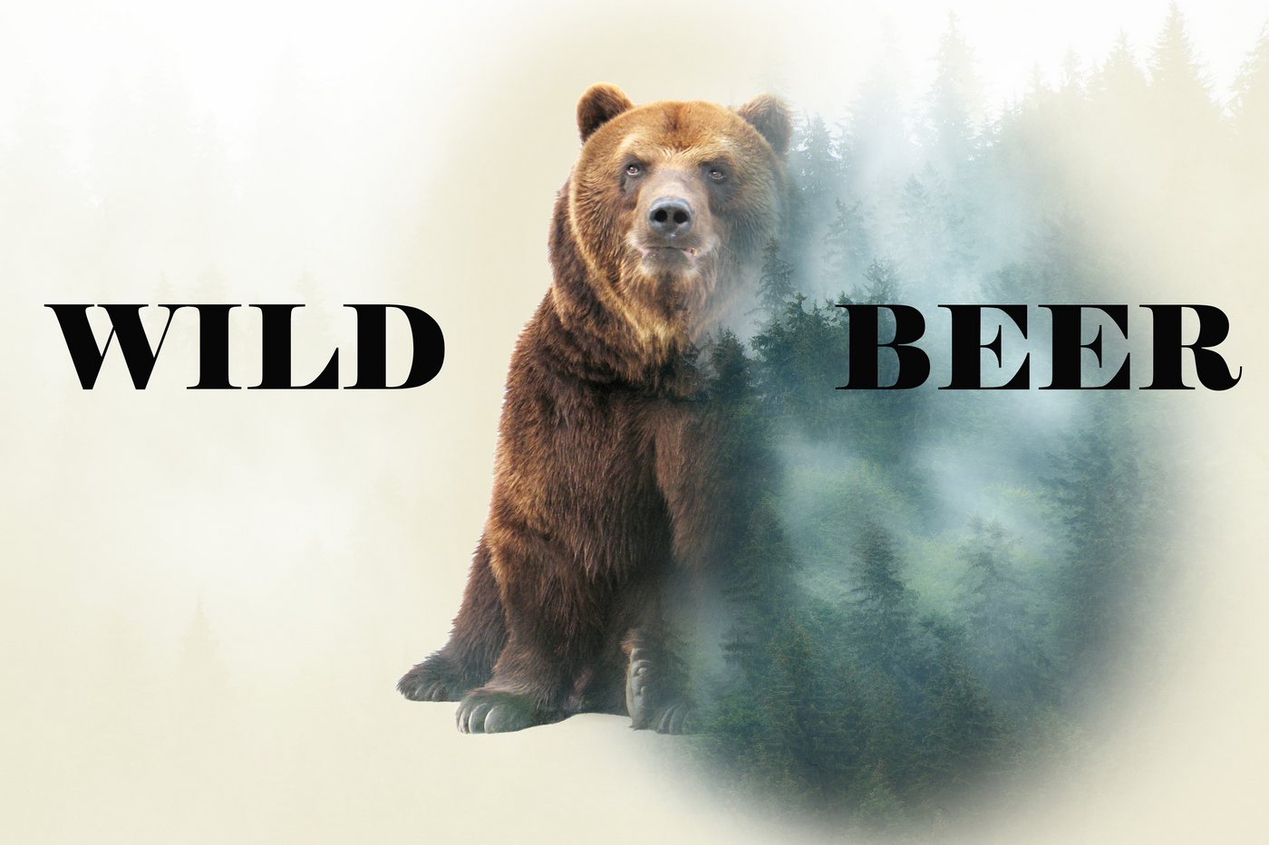
A set of early branding exercises — can packaging, a mountain-badge illustration, a fox wordmark and a beer label — built while learning the fundamentals of Photoshop and Illustrator for packaging and logo work.
Overview
Learning branding fundamentals, one mark at a time
Before working on full brand systems like Crooze, this series of smaller exercises was where I built up the fundamentals — how to wrap a label around a can convincingly, how to simplify a landscape into a clean geometric badge, and how to draw a logo that still reads clearly at a small size.
The fox wordmark was a pen-tool exercise: building a mark from scratch using clean, confident curves rather than tracing a photo. The mountain badge pushed further into geometric illustration, using overlapping triangles to suggest a landscape without literal detail. The can and beer-label pieces were about product presentation — how type, imagery and a mockup come together to make something feel like a real product on a shelf.
Small as they are, these pieces laid the groundwork for the more developed identity work later on — most directly, the Crooze brand system.