
Editorial & Poster Studies
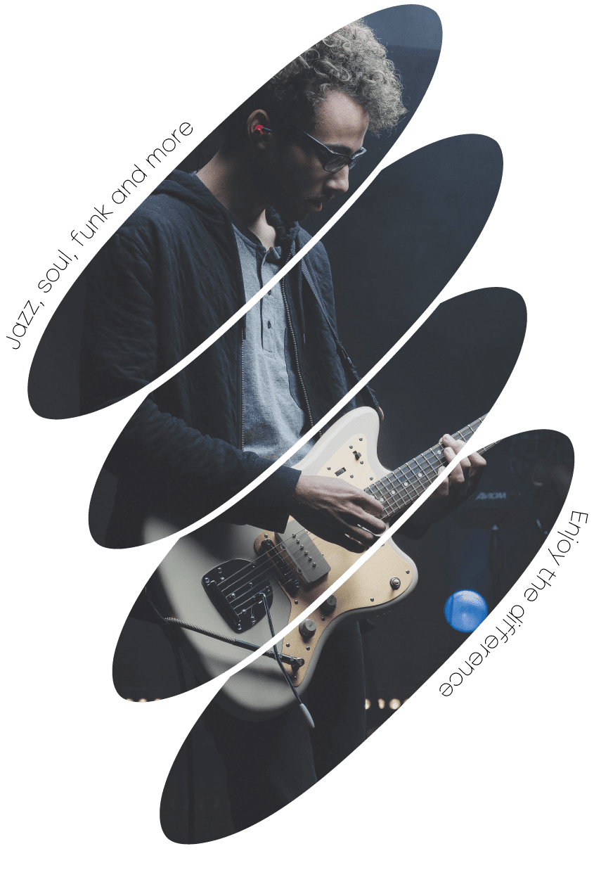
A series of portrait-format poster studies built in Illustrator, exploring how cropped ellipses, rotated type and photography can work together to suggest rhythm and movement — all built around a loose theme of music.
Overview
Finding rhythm through cropping and type
Each poster in this series starts from the same idea: slice a photograph into a stack of offset ellipses, and let the gaps between them do some of the storytelling. The technique forces a photo into a more graphic, illustrative feeling without losing what made the original image interesting.
Type became the second layer of rhythm — short phrases rotated along the vertical edge of each poster, reinforcing the sense of movement the cropped ellipses already suggest. I treated every poster as a small typography exercise as much as a photo-editing one: where to break a line, how tight to set the tracking, how much contrast a caption needs against a busy background.
The loose theme — musicians mid-performance — gave the series a consistent subject to react to, while each poster still explores a slightly different composition and colour mood.